Edward D. Miller — Independent Contractor
Project Overview
Works By Edward D. Miller is a responsive portfolio website for a retiring professor and published author who needed a digital archive for his work. He originally had an outdated Facebook page to hold his work, but it limited accessibility and organization.
His goal was to create a welcoming and familiar experience that was full of personality. He wanted to have a dedicated space that was easy to maintain, to show his work to family and friends, while also providing his contact for potential publishers.
Role
Tasks
Tools
Time
Support and maintenance guidance throughout the year
Who Is Edward D. Miller?
Edward D. Miller is a professor and author who primarily writes poetry and non-fiction work. He was looking to retire soon, but wanted a place where all of his writing could be accessed from one page; these were some of his goals:
- migrate from his Facebook page to a simple, but unconventional website
- easy to update himself every few months
- provide accessible links to his published works
How can we showcase his published work?
Edward originally messaged me to design a personal portfolio to highlight his work while still reflecting his personality and creative style; his writing commonly brings up memories from the past. The website should allow viewers to read his work and allow potential publishers to easily connect with him.
What design decisions helped improve his online presence?
- conducted light competitive analysis (5–10 author sites) to guide layout and hierarchy decisions
- developed a warm and nostalgic visual system aligned with the author's personality and writing style
Measurable outcomes and improvements
- transferred 100% of the client’s published work into one digital platform
- after launching and training, the client successfully updated new work independently without additional support
- improved credibility and accessibility for both personal readers and potential publishers

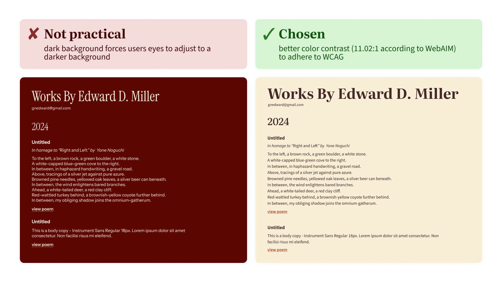
How I achieved the client’s priorities with the visual system
After the initial interview, we established weekly meetings to ensure alignment; we were focused on translating the client’s personality and writing style into a cohesive design system while avoiding the corporate aesthetic.
To follow the warm and nostalgic feel, we decided to go with a warm color palette, choose a typeface that reflects traditional literary aesthetics, but also maintain readability across digital devices. After viewing comparisons between design system components, we reached a style guide that aligned with Edward's personality and writing while maintaining clarity and accessibility.
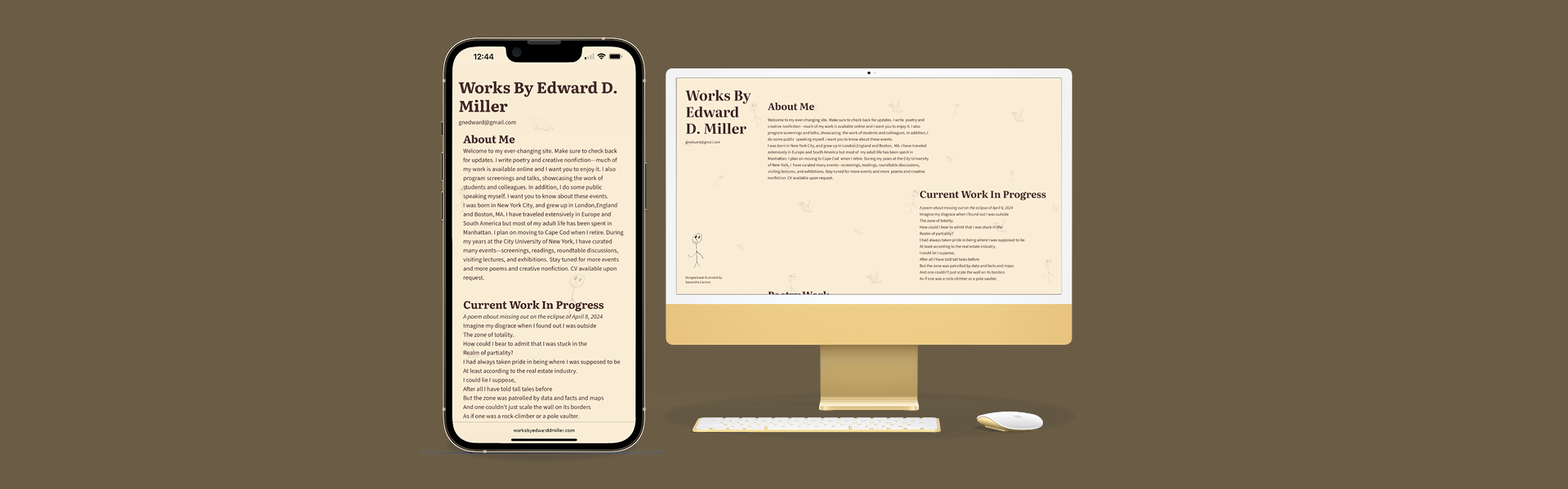
Creating a responsive site that reflects Edward’s voice
After 2 months, we completed the design and development phase, providing Edward a responsive website for his digital portfolio.
A few months after completing the site, Edward reached out to me and said that he was having trouble maintaining the site himself, so for the following few months I assisted him with website maintenance along with some training, which he eventually became more comfortable and familiar with updating his own site!
View website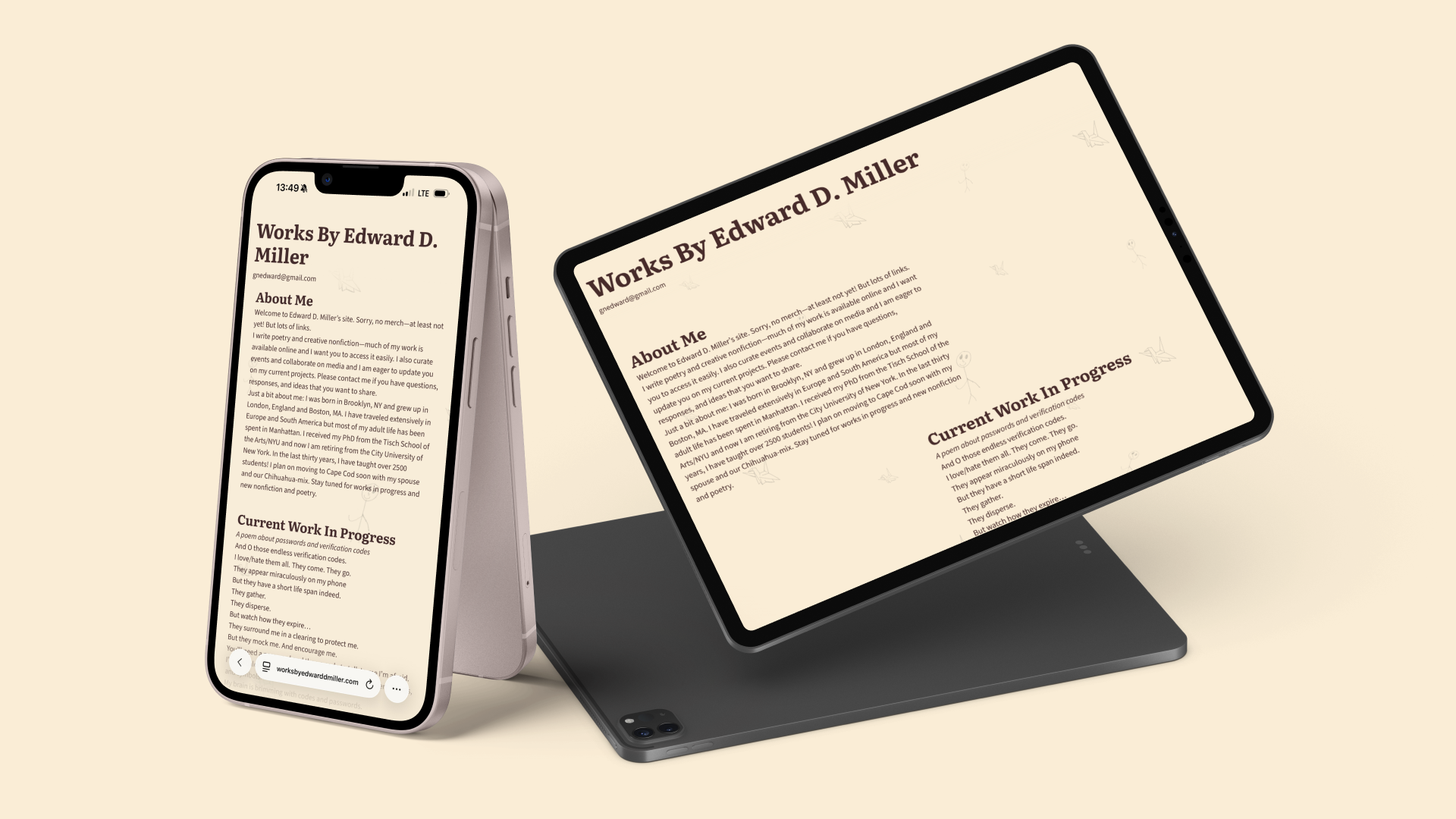
Reflections and client feedback
After completing my first freelance project, here is what the client said about working together.
"Working with Sam is fantastic. She is an extremely skilled designer who understands color and typeface. Importantly, she communicates well with someone who is a non-designer.. Also she listens to your needs and brings you into the process of making a site. I recommend Sam wholeheartedly."
— Dr Edward D. Miller
Successes
- transformed 100% of scattered content from Facebook into a cohesive and responsive website
- designed a dynamic and full-of-personality one-page site that aligned with the author’s writing style and personality
- delivered the project while independently managing client communication and timelines
What I learned
- separating work into sections significantly improved the user flow
- using WordPress to help the client easily manage their own content
- constant check-ins were important to align with the client’s vision and reduce later revisions
Challenges
- balancing client preferences with user-centered design principles
- designing without formal user testing or interviews
- translating the client’s personality into a visual design system
Next steps
- continue supporting the client with site maintenance (completed training)
- conducting future usability testing to refine navigation and content prioritization
- monitor analytics to understand engagement across the separated sections
View my other works
works