Our National Conversation

Project Overview
Our National Conversation (ONC) is a non-profit organization that provides a safe platform for users to engage with unbiased political content and civil dialogue.
Usability testing revealed that the existing website felt outdated and difficult to navigate, which made for confusing user flows, like browsing the site to understand ONC's mission.
Our UI/UX team was tasked with redesigning the website and improve clarity, accessibility, and user engagement before the 2024 election.
Role
Tasks
Tools
Time
How usability testing helped clarify ONC’s mission
Auditing the original website
Before starting the redesign, we reviewed previous user research and conducted a heuristic audit of the existing website. Users often found it difficult to navigate the site because of unclear writing and the outdated interface also reduced engagement and readability. These issues made it difficult for users to understand ONC’s mission and explore its resources.
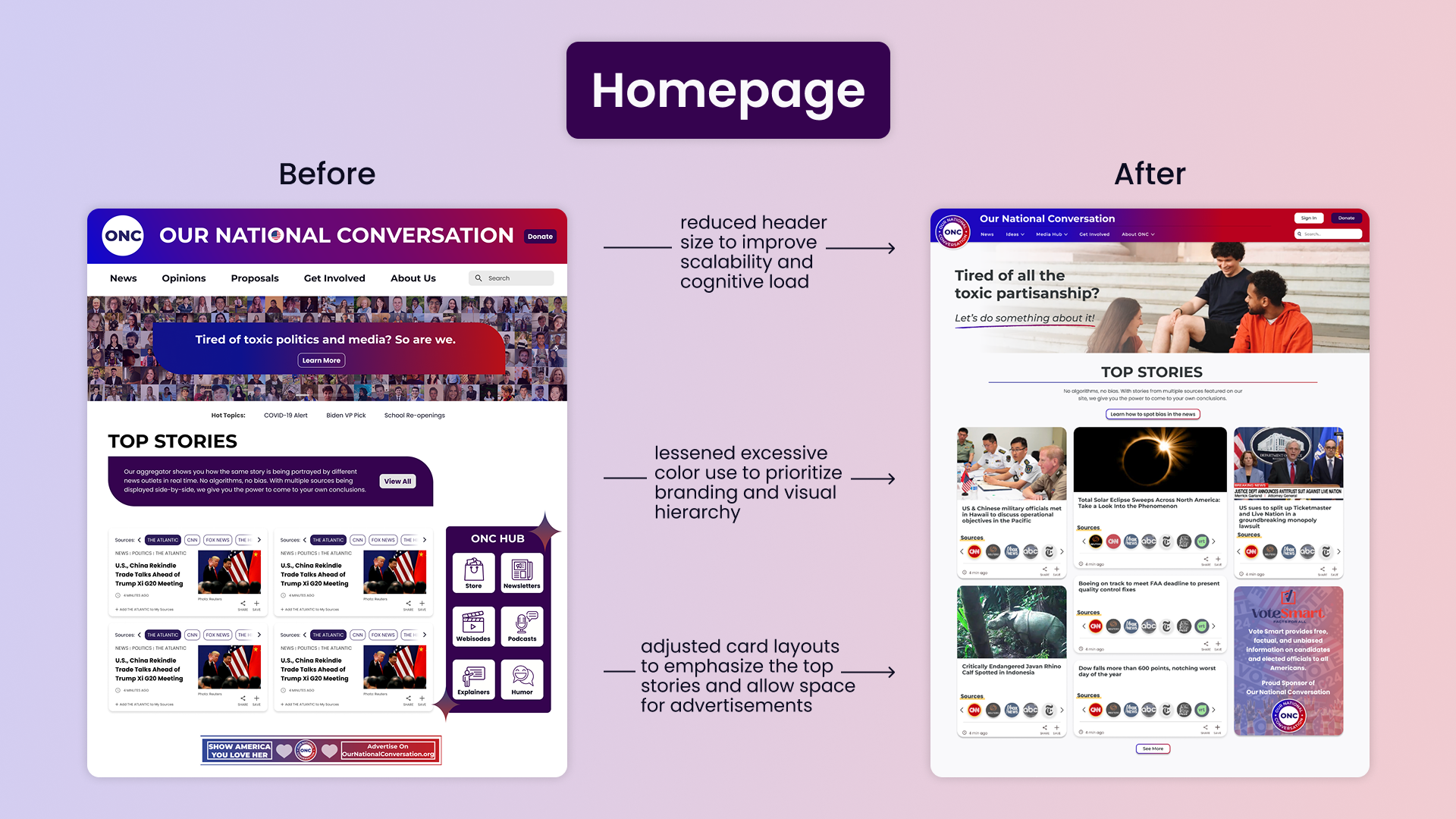
Improvements that we implemented to reduce user confusion
- established a more intuitive navigation system and clarified text to help users easily explore educational content, emphasizing ONC’s mission
- design pages that are responsive for both desktop and mobile screens
- improved accessibility with a design system that aligned with WCAG
Measurable outcomes and improvements
- 80% of users successfully completed navigation tasks during testing, stating that the new site was easier to navigate
- redesigned and modernized 7+ pages, increasing readability and improving responsive layouts
- +30% user satisfaction based off post-test feedback

Synthesizing prior research
Before starting the internship, the design team had previously conducted user research and usability testing. Our goal was to analyze those insights and transform them into design improvements based on these key user paint points:
- 80% of users struggled to understand the navigation labels and system overall
- 60% of users could not understand or explain ONC’s mission after visiting the site
- 54% of users said the site was outdated and text-heavy, also expressing that they would be more likely to use the site if it was more simple and modern
Synthesizing prior research
Based on past research, we focused on these 3 main objectives:
- enhance the navigation system for intuitiveness
- increase engagement throughout site, especially with ONC’s educational content
- improve visual consistency and accessibility across the site

How did our redesign impact the audience?
Before finalizing the redesign, we conducted usability testing with 5 participants to receive a public opinion.
What went well?
- 5/5 users were able to understand ONC’s mission with the new site
- 4/5 users successfully completed important navigation tasks
- users revealed that the visual balance of text and imagery felt more reasonable compared to before
What did users have trouble with?
- a few pages felt too visually similar and it didn't seem like they clicked on a new page
- cluttered content on several pages felt overwhelming
What can we change?
- introduce subsections for easier scanning
- clarify the purpose of the “Explain That” civic education page
- remove content on certain pages to reduce clutter and avoid stressing users

Redesigning ONC’s website to clarify their mission and engage users
Using our usability testing insights and earlier research, we designed a modern and accessible interface that better reflects ONC’s mission and content.
My contributions
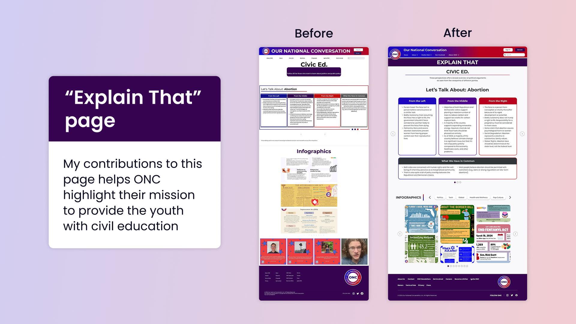
While I collaborated with the UI/UX Design team, I mainly focused on the “Explain That” and “Multimedia” sections.
- enhanced text and background contrast to meet accessibility standards
- refined components in the design system to ensure consistency
- redesigned the “Explain That” page and improved responsiveness across multiple platforms
- created a multimedia hub for all of ONC’s visual and audio content
- made better use of unused content and white space
Reflection, impacts, and growth
Successes
- 100% of users revealed that ONC’s mission became more intuitive
- 30% increase in overall user satisfaction and engagement
- refined 7+ pages and user flows while also making them responsive for different devices
- modernized the website’s design system and branding
What I learned
- how to better maintain consistency across large design systems using components
- advanced prototyping through Figma
- balance stakeholder goals with user and team feedback
Challenges
- understanding how to restructure information architecture and navigation bar with card sorting
- using Figma's prototyping feature for the first time
- balancing text-heavy educational content with readability
Next steps
- utilize feedback from usability testing to improve readability and continued navigation confusion
- introduce site analytics to track user engagement
- create space for advertising placements to help fund the organization
View my other works
View works