HealthXchange

Project Overview
HealthXchange (HX) is a startup built by a team of healthcare insiders who prioritize seamless patient experiences and reward patients for making payments toward their medical bills. This project focuses on a dental practice platform where staff can manage treatments, appointments, and payment requests.
With existing UX Pilot-generated screens, I worked with another designer to simplify complex workflows and modernize the interface to create an intuitive user experience.
Role
Tasks
Tools
Time
How can HX align with their user’s needs?
Auditing their original UX Pilot screens
Based off of existing screens, HX wanted to reduce the cognitive load and organize workflows so that staff could easily navigate daily tasks: view treatments, manage appointments, and request payments.
What design choices reduced the cognitive load?
- condensed and simplified user flows
- reorganized dashboard data into structured sections to improve readability
- strengthened visual hierarchy using consistent typography and spacing
- established reusable components to ensure consistency
Measurable outcomes and improvements
- refined 15+ user flows across the platform (independently streamlined ~7)
- polished 70+ desktop screens (independently redesigned ~35)
- reduced unnecessary navigation in key payment and appointment workflows
- created the foundation for a scalable design system

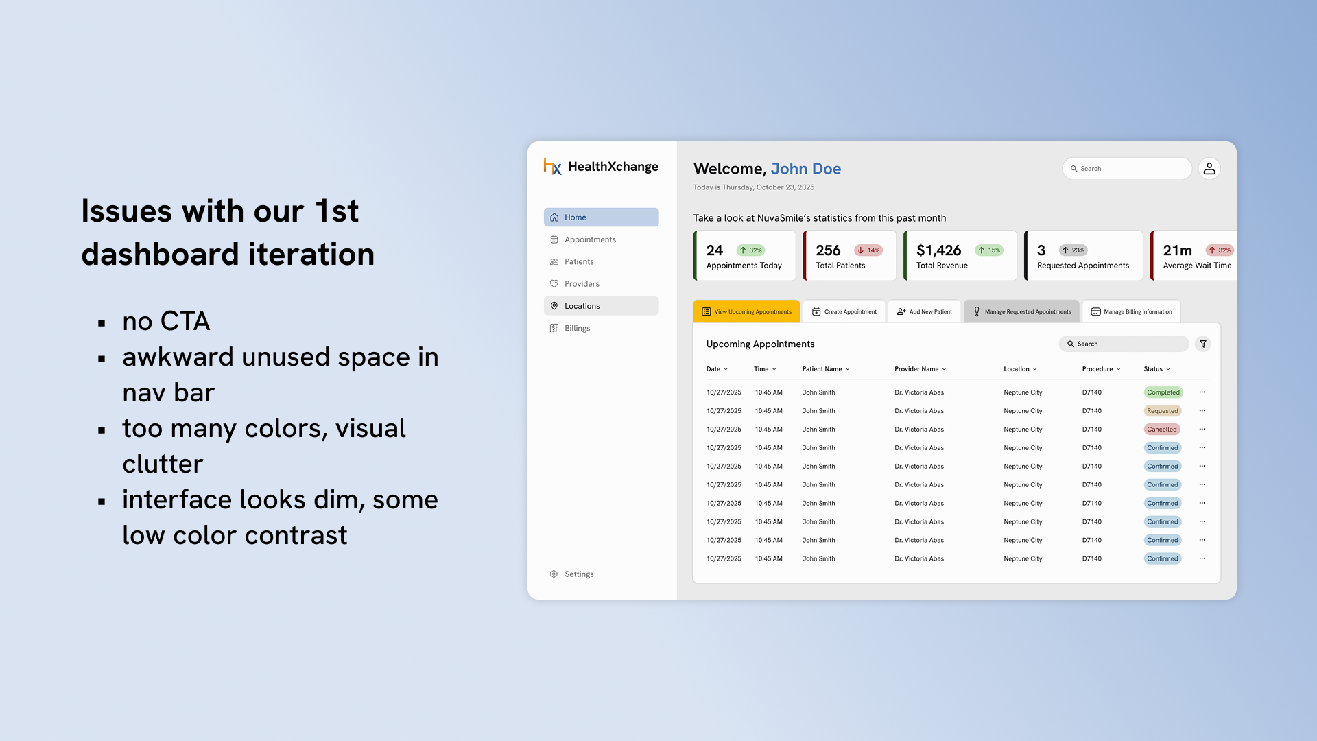
How I discovered workflow friction in the dashboard
While reviewing the original dashboard, I noticed some concerns regarding an intuitive user flow:
- common actions were only possible when opening another page
- no differentiation between appointment and patient data, competing visually in terms of hierarchy
- no clear primary action on the dashboard
What was changed to improve daily interactions?
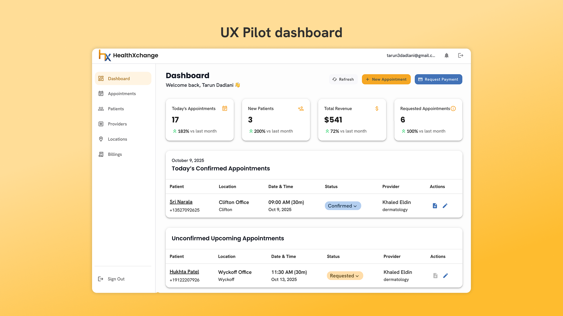
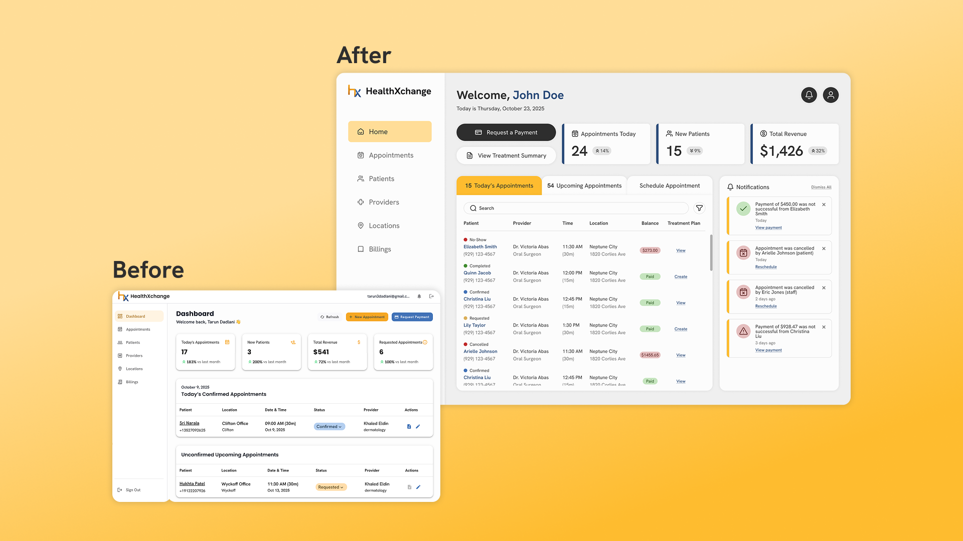
After auditing the dashboard and its workflow, I saw the opportunity to reduce navigation and allow staff to complete important tasks where they were already working, the dashboard. Here were one of the first iterations for the new screen.
Redesigning the dashboard for action and clarity
The redesigned dashboard was restructured to include important features and improvements that are aligned with staff workflows:
- strengthened visual hierarchy and introduced a clear primary CTA to guide user focus
- reduced navigation friction by allowing for everyday-tasks, like appointment scheduling, to be done directly within the dashboard
- reorganized appointment data into a more scannable table structure
With these changes, staff can now complete appointment scheduling within their primary workspace.
We were able to lessen unnecessary content switching and improve overall efficiency while establishing a structured foundation for the other screens.
[Due to NDA restrictions, additional flows and screens are not publicly displayed.]
Impact, constraints, and growth
Successes
- independently simplified ~7 user flows and refined ~35 screens
- established foundational branding elements and UI consistency
- strengthened visual hierarchy across complex, data-heavy screens
What I learned
- prioritizing high-impact workflows under time constraints
- collaborating closely with designers and engineers to ensure an intuitive and scalable design
Challenges
- delivering improvements across ~70 screens in a 3-month timeline
- brainstorming how to stand out from other similar platforms
- designing for a B2B SaaS healthcare platform for the first time
Next steps
- demo the platform to potential clients
- conduct usability testing with dental staff and users to gain feedback and iterate designs
View my other works
View works